Sunday, May 31, 2009

sophisticateur: paul costello

i have made a recent discovery which i MUST share with all of you. paul costello. ridiculously amazing photographer of interiors, fashion, etc. etc. upon "discovering" him i realized that he is responsible for just about EVERY interior feature that i have loved in a variety of dwell magazines. i love his ability to capture the essence of a room--and when he DOES incorporate "human subjects," it only futher enhances the essence. here is some of his work.
...happy sophisticating...


Sunday, May 10, 2009

design obsession: frames

walls covered with framed photos are nothing new...even the most simple home will have a variety of family photos displayed on the wall. in the last ten years or so, everyone picked up on the pottery-barn-crate-&-barrel-ikea trend of lending a sense of intentionality to these framed photos. matching frames or photos with a similar color palatte can create a fabulous design statement on a large wall without excessive cost.

a recent visit to the donovan bar & lounge at brown's hotel in london revived my love of this look and the sophisticated effect it can have in a room. it also led me to observe that this trend camps in one of two extremes:
perfectly measured rows of framed photos
OR
scattered, happenstance, vintage-loving arrangements displaying a variety of media (paintings, sketches, photographs, etc etc).
here are a few case studies of each extreme!
...happy sophisticating...


the source of inspiration--the entire room was outfitted in various shades of gray. these beautiful, sometimes controversial photos all framed uniformly and displayed in perfect rows beautifully echoed the gray plaid on the banquettes. utter sophistication.

another shot of the donovan bar.


here, the framed photos on the right-hand wall in this dining room echo the long horizontal lines on the beautiful molding. the simplicity of their placement perfectly suits the tidy dining room.


pottery barn at its finest. proving, also, that you can frame just about ANYTHING and create a nice focal point for a large wall.


the layering of these frames adds some extra visual interest.


the epitome of "flea market chic," the placement of these frames perfectly captures the very bohemian tone of the room. here the designer has added additional texture by using a variety of materials to suspend the framed photos.


and again, pottery barn's twist on the trend. all of the photos are either black and white or sepia tone, which prevent the wall from becoming too busy in what seems to be still a rather refined home. the variety of finished featured on the bench and accessories below help to lend a sense of reason and intentionality to the variety of frame finishes. the plant on the bench brings an organic quality necessary to keep the entire display from becoming too weighty.


altogether lovely. fresh, clean and modern. this room is a nice balance between calm and colorful. the wide mattings used within the frames prevents the multi-colored artwork from feelings too busy or cluttered in this serene space.


the strong colors in this room make the stronger frame colors work. additionally, the designer has used the brown, black and white in both the frame finishes and elsewhere in the room (floor, sofa, rug, throw pillow). this gives a sense of intentionality to the framed photos. also notice that these are less sprawling on the wall. this gives the entire display the appearance of being a single "installation." had the photos covered the entire wall, this would have been overwhelming and heavy. in its current arrangements, it's just interesting and not too weighty.


a more vintage twist on this trend. lining up the photos on the mantle makes this trend feel even more natural. the white backdrop of the mantle creates a perfectly clean and simple backdrop for the display. also, the incorporation of accessories, plants and trinkets amongst the frames makes this arrangement feel especially personal. one of my favorites!

Saturday, May 9, 2009

event gallery: inaugural dinner

this is by far my favorite event ever. we were celebrating the inauguration of our new president, dr. barry h. corey. this dinner event was the kick-off for an entire weekend of festivities. with guests coming from all over the world, we had to give the perfect first impression. it was still a challenge to turn a tent on the lawn into a sophisticated, classy and elegant dining room, but the result was absolutely breathtaking.
photos by michael musser
...happy sophisticating...

our colors for the entire weekend of festivities
were white, navy blue and gold. very presidential.


beautiful candle sconces lined the entrance to the tent


exquisite floral arrangements, by themes and flowers.


the chandelier and tent treatment truly MADE the decor.

event gallery: ruby slippers luncheon

one of the things i love about working at biola is their committment to being culturally relevant. during our centennial year, we developed the very first national women's history month celebration at biola: the ruby slippers luncheon. now in its second year, we've had two fantastic luncheon events. both years we have had rather limited budgets, but with a little creativity and a lot of collaboration, the ruby slippers luncheons have been
perfectly fresh, feminine and inspiring.
...happy sophisticating...

red swagging is a simple, but dramatic way to
dress up even the most basic white tents.


the biola ruby awards. add tulle to anything and
you can instantly "sophisticate" the ordinary into
something fabulous and feminine.


when in doubt, wrap it! simple brown boxes become fun and creative centerpieces when wrapped in beautiful paper. in this case, we had an international theme so we selected internationally-themed papers all in shades of red. and the fabulous ruby slippers? we took shoes from thrift stores, spray painted them red, rolled them in red glitter and voila!


a view of our speaker, jonalyn fincher, in her fabulous, thematic outfit.
also note the INREDIBLE red rose topiary to the left.

Sunday, May 3, 2009

event gallery: easter brunch

my passion for event planning combined with the thrill of finally being quasi-settled in our new apartment has led me to a somewhat overzealous pursuit of entertaining. my husband has put this zeal on a bit of a hiatus for the sake of our bank accounts, so i must revel only in the memory of our last gathering. easter brunch at our home was all that it should be...fresh, full of spring, a little overcrowded and utterly, decadently delicious. here are a few photos to show that even the most simple family gatherings can be sophisticated.
photos by danny paschall
...happy sophisticating...

placecards can be used as menu cards to tie together
your theme and give credit where credit is due.


supermarket flowers can look sophisticated when you
break apart bouquets and put your own spin on things.


grandma's goblets being put to good use.


the beautiful buffet


my beautiful friend bethany, enjoying her brunch!

the family settles in amidst the hors d'oeuvres--
featuring fresh veggies and chilled cucumber soup


for dessert, coconut cake.
the epitome of springy freshness.


and of course, chocolate dipped strawberries.
doesn't everything look better on beautiful white platters?


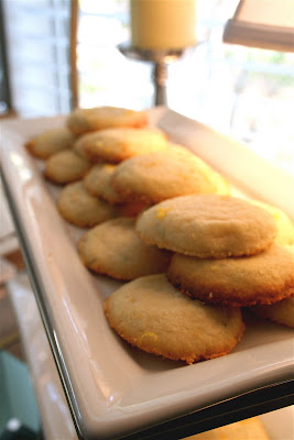
everyone's favorite of the day: lemon rosemary shortbread cookies.
unreal.


more flowers, alongside our new coasters.
so cheeky!


Saturday, May 2, 2009

design obsession: modern planters

my husband and i were fortunate enough to spend the first few days of the new year in merry old england. whilst in london (whilst. hehe.), i became obsessed with these modern planters i saw on (what felt like) every doorstep...gracing the entrances of flats or outside of chic little boutiques. i thought i'd snap a few shots of these fabulous finds. they make even the most traditional of english hedges and topiaries feel fresh and updated. i wouldn't recommend them, however, with anything but the fullest of foliage. any sort of spacing would make these planters feel a bit sparse. i'm determined to find some to spruce up my sad little patio.
...happy sophisticating...


a slightly more organic look in wood


a very "glam" take on this trend...rhinestone covered! too fabulous.

design obsession: dark walls

of course i would develop this design obsession just after i've painted my entire apartment a light and creamy, dreamy gray.HOWEVER, i am LOVING the emergence of dark, dark walls! i'm not talking chocolate brown either, because we've seen that forever. it's nice and all, but i'm talking black or navy. it lends a sense of weightiness and formality to the most hodge-podge of homes. against dark walls, everything looks intentional, grown up and...sophisticated! here are a few examples for your viewing pleasure!
...happy sophisticating...


sophisticated...even in the kitchen!
such fun with chalkboard paint.


in white, the furniture in this room could be lost and too ethereal.
but with deep navy walls? sophisticated.

event gallery: legacy gala

february 2007. hyatt huntington beach.
biola's second annual legacy gala.

perfectly elegant.
...happy sophisticating...

event gallery: my wedding

okay, maybe it's a bit egocentric, but being an event planner i DID, of course, plan my own wedding...and i have to say i thought it was rather fabulous. i cannot begin to tell you how many things failed to go as planned (how ironic) but the overall aesthetic was completely in line with my vision.
...happy sophisticating...

photographs by michael musser


our invitations, designed by michael musser of anticipate invitations


our venue: the orange county museum of art in newport beach


jumbo balloons featuring our custom monogram,
also created by michael musser


the stage where we were wed!


modern art gallery + grandma's vintage furniture = vintage modern fabulous


rather than standing at attention, our bridal party
sat on the vintage furniture in portrait groupings during our ceremony


our programs, displayed in a vintage suitcase


we hired a silhouette artist to cut silhouettes of our guests
for them to take home as a special remembrance of our day


our guestbook: a vintage typewriter

the end!